便利蜂终端形象2.0
Convenient bee terminal image 2.0
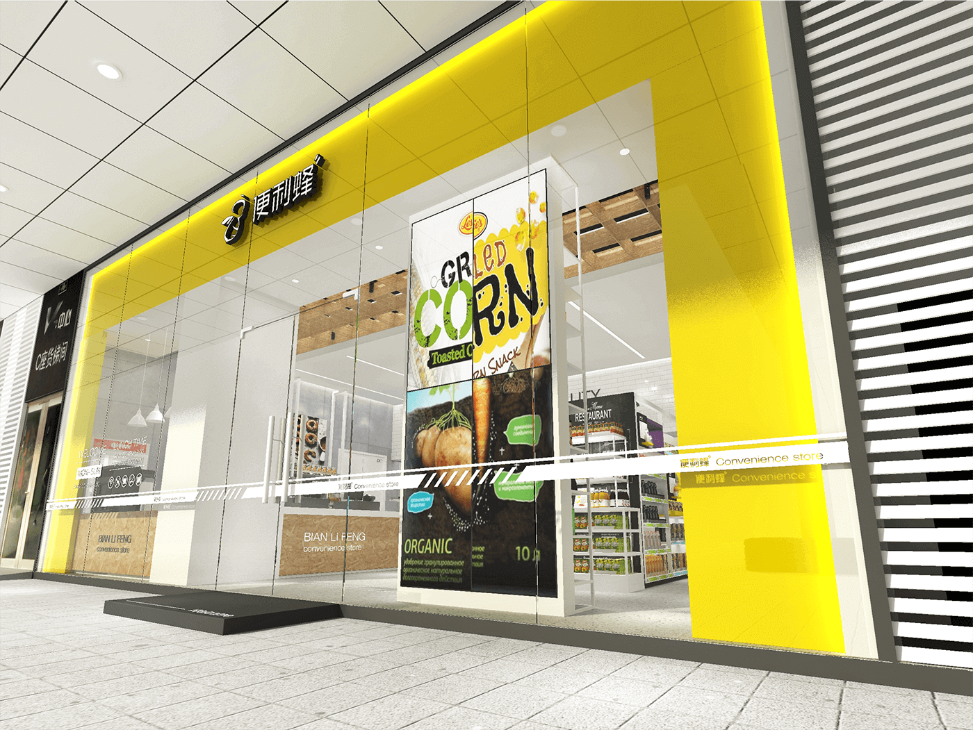
便利蜂2.0店面形象2018年8月落地,概念终端形象升级。
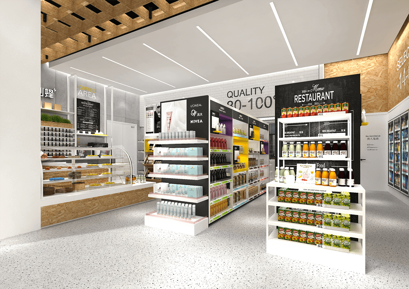
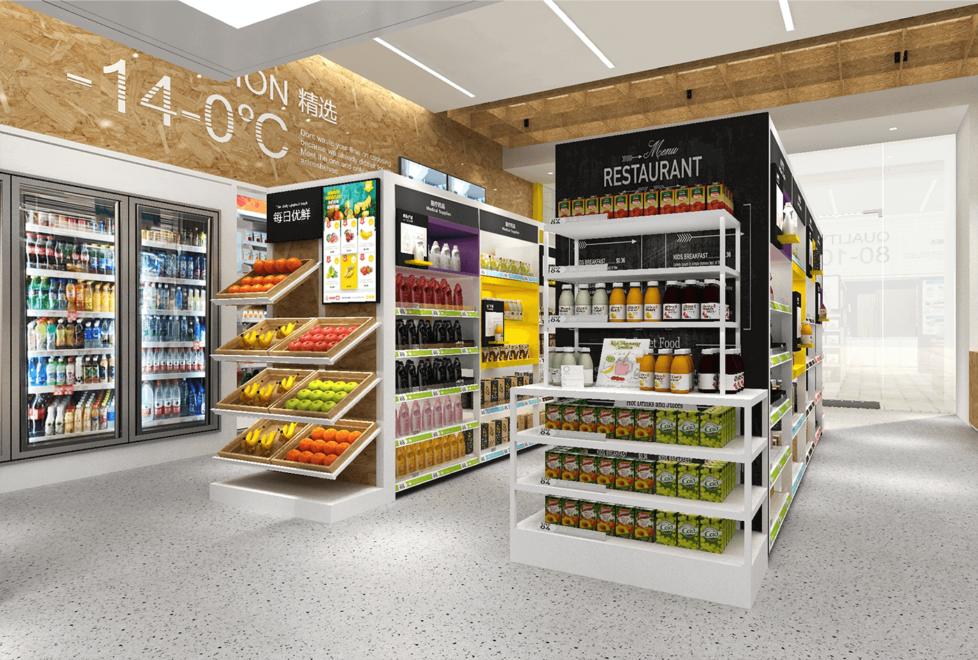
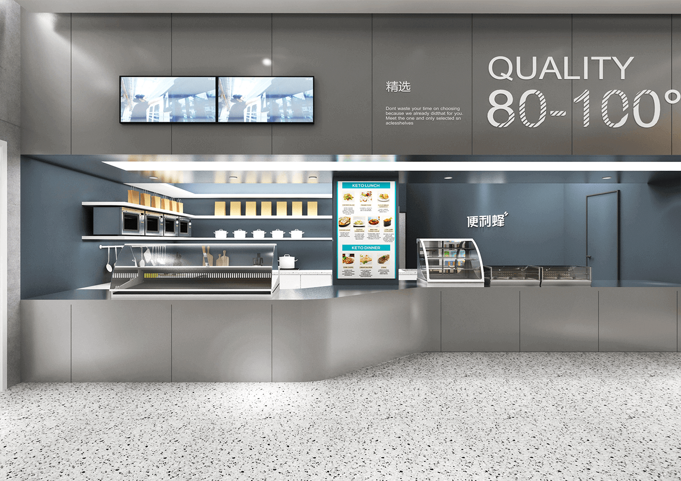
核心概念-以“温度”为基础划分产品、功能、区域,-14°~4°冷食区、4°~39°常温区、39°~100°热食区,整体空间选用环保材料麦秸板为主材。
全新商超道具体系开发,极专业的灯光配合商品展示。
空间整体以白色系为主,搭配温馨的木色并以帅酷的喷砂金属板为点缀打造一个新零售空间体验。
Convenience Bee 2.0 store image landed in August 2018, and the concept terminal image was upgraded.
Core concept-divide products, functions and areas on the basis of "temperature", -14°~4° cold food area, 4°~39° normal temperature area, 39°~100° hot food area Main material.
The development of a brand-new business super prop system, highly professional lighting and merchandise display.
The space is mainly white, with a warm wood color and a cool sandblasted metal plate as an embellishment to create a new retail space experience.


